
By The UOW Library Digital User Experience team (Carina Tobia, Content Experience Officer | Pia Petre, Content Designer | Kyra Thomsen, Digital User Experience Lead)
At the University of Wollongong Library, our Digital User Experience (DUX) team uses research, analysis, design and iteration to ensure our content and services anticipate and meet the evolving needs of our users.
We see UX as complex and holistic, with omnichannel user journeys that may be in our digital space, at one of UOW’s multiple Australian campuses, or across the globe. Listening to our users through qualitative and quantitative data is central to our work and provides insights which inform UX improvements.
Uplifting the look, feel and navigation of our LibGuides
Our LibGuides were last reviewed in 2018, and with the intense crisis period of the pandemic coming to an end we wanted to take a proactive approach in 2023, aiming to update the guides’ visual design and content.
We did environmental scanning, and a Qualtrics survey of students and staff resulted in 57 responses. The survey included quantitative, affinity statement questions (e.g., “It’s easy to find what I’m looking for in library guides”) and space for qualitative, free text responses. We identified several ‘quick wins’ to prioritise.
Group guides by subject to reduce choice overload
Users told us our long A to Z list of guides was only useful if they knew the exact name of the guide they were looking for, so we moved away from the alphabetical list and opted for an organised view of subjects on the guide homepage.
We consolidated seven subjects into four and reduced the number of menu buttons. This update reduced scrolling and ‘choice overload’ making it easier to browse guides.
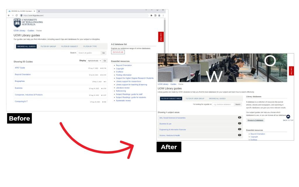
Make the guides more visually appealing
Users told us that LibGuides lacked visual appeal, so we updated several design features including:
- adding a new, branded photograph banner to the header of all guide pages
- updating the default Springshare favicon to the UOW crest icon
- updating the back-to-top button for branding and consistency.
These changes created a seamless transition between the UOW website and LibGuides, and showed users that the information in our guides is up-to-date and reputable.
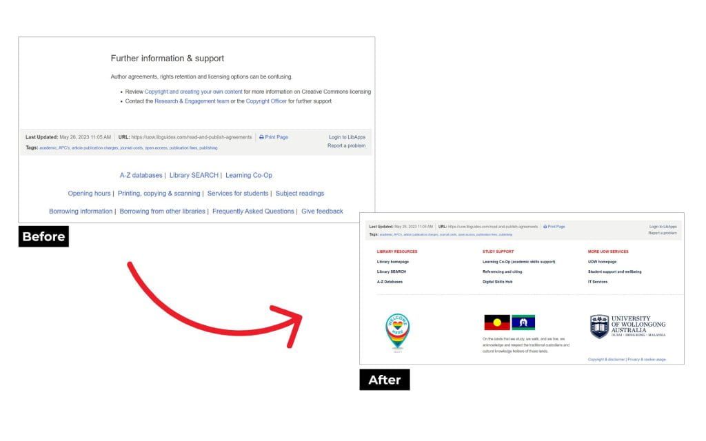
Improve navigation and promote inclusivity in the footer
Users told us the footer was busy, unstructured and underused. We updated it with links to high-traffic, relevant, useful pages and organised these into logical groups.
UOW Library’s Thriving Digital Library Strategy 2022-2024 outlines the importance of “being welcoming, inclusive and culturally safe in all Library spaces (physical and digital)”. This prompted us to add the ACON ‘Welcome Here’ icon to the footer which mirrors the stickers in our physical libraries, and we included UOW’s Acknowledgement of Country.
Signage UX that overlaps the digital and physical spaces
In taking a holistic approach to UX, we know our clients can interact with the library online, in-person, both or neither throughout their journey.
“Thinking from the perspective of the user, we can see the library as a large, interconnected web of these service points woven together… Library users move across different channels”. (Polger 2022, p. 33)
Library signage is one example where UX skills in user journey mapping and visual design combine with the tangible, physical library building.
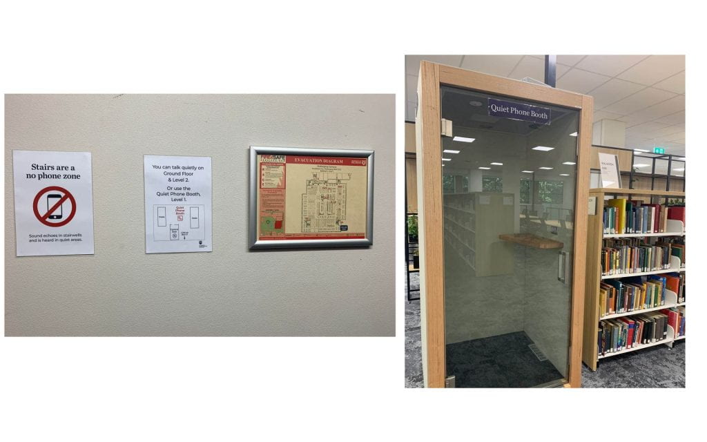
Stairs are a ‘no phone zone’
A common library conundrum of clients talking in quiet spaces such as stairwells prompted a cross-team approach, which included installing a new ‘quiet phone booth’.
We drafted several iterations of poster signage to discourage clients from talking in stairwells and encourage them to use the new quiet phone booth.
Informed by a walk-through of the space and ‘disguised naturalistic observation’ (Polger 2022, p. 16) (I.e., people watching), the team created a poster using Adobe InDesign which included:
- a universal symbol which could be understood at a glance
- plain language which could be read from a distance
- a simple map showing the location of the new quiet phone booth.
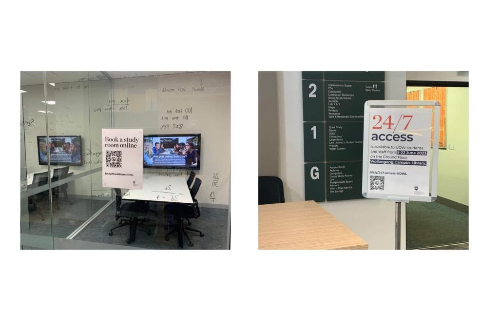
QR codes in point-of-need signage
With the popularisation of QR codes during the pandemic, we started including them on our print posters in addition to short links (using Bitly), optimising ways users can interact with Library services from their devices.
One long-standing poster outside most study spaces allows clients to book a room with QR codes and short URLs linking to the online booking system LibCal. Updating the posters to include QR codes in early 2023, these have had 64 scans since January. With a new LibCal user interface being released, we’re looking forward to an even more optimised mobile experience.
A pilot of 24/7 access at Wollongong Campus Library saw a need for several types of poster signage including promotional, operational and directional. QR codes were used to link clients to a website with detailed information about the 24/7 access and these were scanned 31 times during the 3-week period the posters were accessible.
If you are interested in finding out more details about any of these activities, please contact us at content-strategy@uow.edu.au
References:
Polger MA, 2022, Library signage and wayfinding design: communicating effectively with your users, American Library Association, Chicago.
Kia ora koutou.
Thank you for this post. It comes at a great time as our library has created a UX team who are looking for projects. I love the way you looked at your UX project holistically by combining questions about the LibGuides with the physical library environment. We have looked at the latter but it maybe useful to now look at the former! Kia kaha, Catherine.
Catherine Doughty
Law Subject Librarian
Te Herenga Waka Victoria University of Wellington