Lost in the Open Sea: Practical guidance for finding and creating inclusive OER

Ash Barber, Librarian and OER enthusiast

Do you ever feel kind of lost in the sea of resources out there, trying to figure out how to create or find high quality open educational resources (OER)? Those ones that tick all the boxes for great content and promote equity and inclusion?

Me too.

So I went on this trip.

The beginning

For a few years, I’d been peering curiously at the higher education world of North America, watching as they made leaps and bounds in progress towards creating OER that are steeped in concepts of inclusion, diversity, equity, and accessibility – and wondering how can we make these leaps here in Australia too? So, when the Libraries of the Australian Technology Network (LATN) announced a Fellowship opportunity to explore OER on an international study tour, I grabbed it and ran – well, flew – to that magical mystery land I’d been observing for so long.

The broad theme of the Fellowship project I proposed was the development of some kind of resource that curates other resources (a meta resource, if you will) to help Australian librarians better understand the identifying characteristics of OER which influence greater equity and inclusion in education, and to harness this knowledge to empower others to raise their marginalised voices.

The middle

Galvanised by a deep belief in this idea (and the narcoleptic superpower of dodging jetlag), in September 2022, I finally stepped foot in Los Angeles, ready to fangirl my way through a whirlwind two and half weeks of 21 meetings with 46 people I could. not. wait. to. meet.

I attended and met with a multitude of institutions that are home to many open education thought leaders across Los Angeles, Vancouver and Minneapolis, and held a number of incidental conversations along the way. Institutions included:

I am ever grateful to all the lovely humans who met with me for their generosity of time, wisdom and kindness.

The empowered future

These conversations informed the creation of EmpoweredOER (the promised meta resource), a website which helps practitioners wade through that open sea to find a set of resources, concrete examples, and guides curated to the Australian context. It provides a wider theoretical understanding of equitable education principles then grounds them in practical exemplars of OER that meet these needs. EmpoweredOER aims to help people who feel a bit lost amongst it all to find a solid set of parameters to work within.

The website uses the BranchED Equity Rubric for OER Evaluation as the framework for looking at individual aspects of OER with an equity lens.

Often when we talk about creating OER that are “accessible” we’re thinking about alt-text and screen-readers. That’s not a bad thing, but it’s just one step in the direction of access. It’s not thinking about “accessible” in the broader sense of cultural sustainability and multiple ways of learning. The Equity Rubric for OER Evaluation explores these deeper levels of access, but doesn’t give examples demonstrating concepts. EmpoweredOER builds on the Rubric to provide tangible examples found in the wild which help ground the (often high level) language and explanations.

Why is the site called EmpoweredOER?

I’m glad you asked!

OER empower because OER remove the barriers to publishing. In traditional publishing, you have a “gatekeeper” – the one who decides whose voice will be heard and what they’re saying. This necessarily marginalises some voices and elevates others. However, anyone can publish an OER. Anyone can get their voice out there, can tell their own story and not have their story told by others.

OER also afford the opportunity for students to be involved in the co-creation of new knowledge and to have their own voices represented, to see themselves reflected in the material they’re studying in the classroom. One of the great examples I came across in the US was this program called Open For Antiracism (OFAR) which trains teaching staff in antiracist pedagogical practices, including the use and creation of OER as a tool to this end. One of the problems the program addresses is that materials in the classroom don’t always represent the people in the classroom. An OER can be modified, adapted, become a collaborative piece in which students can see themselves and build a sense of belonging: They’re welcome here. This course is for them. They’re not on the outside looking in.

The call for support

If you’d like to learn more about EmpoweredOER, please tune in to my upcoming webinar Demystifying inclusive OER: Practical guidance for finding and creating equitable OER which I am co-presenting with Tanya Grosz from the Open Education Network. I also gratefully welcome any feedback on the website (its content, structure, usability) and any suggested resources to include.

You can get in touch with me at Ash.Barber@unisa.edu.au or follow me on Twitter @AshTheLibrarian.

Creating accessible content

Luke Gaiter, Senior Manager – Digital Capability Support, The University of Queensland Library
Miranda Newell, Digital Content Specialist, The University of Queensland Library

Accessibility benefits everyone

Making content accessible isn’t just about changing existing things or establishing new ones to help a specific group.  It’s about shifting how we do things on a structural level to remove barriers that could affect anyone, permanently or temporarily.  

Accessibility involves thinking about your users and trying to reduce obstacles which prevent people from using the environments, systems and digital tools that others may take for granted.

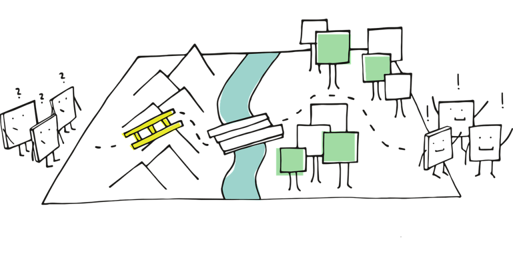
Characters look confused about having to navigate a ladder over a mountain, a bridge over a river and travel a windy path to reach the other side.
Image by Manfred Steger from Pixabay.

Universal design

‘Universal Design is the design and composition of an environment so that it can be accessed, understood and used to the greatest extent possible by all people regardless of their age, size, ability or disability.’

Centre for Excellence in Universal Design

Screen Reader Demo for Digital Accessibility (YouTube, 4m44s) shows how screen reader users can efficiently navigate through content and what happens when content is not set up well for accessibility.  

Content elements

When you create content there are key elements to consider to make your content more accessible.

Structure

Content structure helps users to navigate the text. This can be particularly helpful for users with neurodiverse medical conditions.  Use:

  • heading styles and consistent formatting. Do not skip heading levels. Headings are used by screen reader and other assistive technology users to navigate through content 
  • short paragraphs that cover a single topic  
  • lists to present content. Lists tend to be easier to scan and often require fewer words   
  • Descriptive links. Let your user know what will happen when they click on the link.  

Language

Use simple and clear language when you write your content. Plain language is concise, well structured and easy to understand.

Tool to help – Hemmingway editor

Text (fonts)

The type, size and format of text can affect the accessibility of your content.  

  • Use a Sans Serif font. Sans serif fonts are designed to be simple and easy to read.   
  • Set font size to be at least 12 points for body text. This is the minimum size recommended for low vision and those who have a form of cognitive disability.  
  • Limit the use of bold, Italics and CAPITALS.  

Helpful tools: 

  • Dyslexie font helps to increase the ease of reading and comprehension for some users with dyslexia.  
  • The Ascend browser extension allows users to add accessibility features to their browser, including for dyslexia.  

Colour

Check the contrast of the colours you use. Ensuring good contrast between foreground and background colours is important for users who have low vision or colour blindness.   

Tools to help you:  

Images

Add alternative text (or alt text) to images you use in your content. 

  • Be as descriptive as possible.  
  • Any diagrams or charts will also need to be explained.  
  • An alt text description is unnecessary if the same information is available in text near the image or is used purely as a decorative element.  

Video and audio

Video or audio content should have captions and transcripts. If captions are not included, users who are deaf will miss out on the dialogue and any important sounds. A transcript allows people with deaf blindness to access the content using braille software.  

Tables

Tables can be difficult to navigate and understand for those using screen readers if they are not set up to be accessible. Use headers and properties so that screen readers can read out the row headings along with the cell information. Try to keep tables as simple as possible and avoid merging cells.

Helpful guide – Creating accessible tables.

The University of Queensland Library supports staff and students to create accessible content by providing:  

 Adapted from Create accessible content by the University of Queensland under a Creative Commons Attribution-NonCommercial 4.0 International License.

Declutter your digital writing – for inclusion, clarity and better reader experience

Originally posted on Deakin University Library’s DigiBytes blog

By Rachel Wilson and Kat Cain of Deakin University, republished with permission from the authors

Photo by Glenn Carstens-Peters on Unsplash

Decluttering is not just about your digital files, your cutlery cupboard, or your work desk – it also is a handy approach for digital writing. Clutter distracts from the clarity of your writing. Unnecessary words, complicated sentences, and redundancies can all mess up the flow of your writing. Which means your core message or learning point is lost within the word noise. 

Decluttering is a great strategy for writing in many different contexts, using plain language in digital spaces like blogs, guides, websites is critical and inclusive. It means your content is readily understandable, scannable, and straightforward. Most of all it makes your content more useful to your learner or reader.  Check out this Evolving web post for a good breakdown of why decluttered writing works so well for inclusion and why plain language matters. 

Strategies, concepts and tools to help 

Here are three key tips that can get you started in decluttering your digital writing. They can help you tighten your prose, your email, or your module text. In fact, these writing skills can be applied everywhere, not just writing web page content. 

Tip 1: Consider your audience 

Who are you writing for? 

  • Undergrads  
  • Professional staff 
  • Industry 
  • Researchers and academics  

Different reading levels are OK for different audiences. Vocab will change depending on the context. 

  • Grade 7-8 for your average audience  
  • Grade 10-12 for experts in your subject matter 

Tip 2: Use tools to Marie Kondo your content 

Using editing and grammar tools can give you a strong idea on how readable your content is, how clearly your message scans.  

Tip 3: Keep it clean and uncluttered 

There are a number of things you can do to keep your digital page clean. Avoid jargon and go for simpler wording where you can. Also carefully consider image use on your digital page as it can dilute your message. Use headings, lists and ‘calls to action’ to make your content more structured and scannable. Don’t cover too many topics in the same space!  

Key take away 

Don’t strive for perfection in your digital writing – we love iterative improvements. As Leo Tolstoy said “If you look for perfection, you’ll never be content” (Anna Karenina). 

via GIPHY

Creating video templates for shorter lead times and greater consistency in library tutorials

by Nicholas Rowsell, Digital Library Programs Officer, University of Newcastle Library

A challenge in creating anything across a team, or to a greater extent an institution, is ensuring that when content is created there is a consistent design language, and when adhering to this requirement, efficiencies are not lost.

To communicate your ideas with this purpose in mind, content should be:

  • aligned to brand positioning,
  • consistent between digital objects,
  • as equitable and accessible as possible
  • solutions should match your team’s abilities
  • lean into established processes when adding something new.


In wanting to establish new processes for the creation of a video tutorial series for the University of Newcastle Library, these were the considerations we had to address.   

Our solution was to create a series of templates for video creation programs such as Powtoon and Microsoft PowerPoint. By providing content creators with a series of template slides they are quickly and easily able to copy a slide and insert the content they need to present, with all the animations, transitions, and formatting completed for them ahead of time. All that is then required is for the team member to render the slides to create a video. The positive implications of this are that videos are highly sustainable and scalable, as content can be edited or updated on the slides and re-rendered as needed to reflect an updated syllabus, changes in technology or services, and so on.

So how did this solution come about?

Alignment with brand positioning

Our priority in creating a new video series was to align the look and feel of content to the University’s Brand Guidelines. This meant ensuring that our team members used the correct typography, colours, shapes, and images.

We quickly identified this as a pain point as the time taken to set up a file, create a design, then undertake a quality assurance check distracted from the goal of the content being created and released.

This is where our solution to create video templates first came about.

Leaning into existing practices

One of the first lessons learnt in our solution was to lean into what the team was already doing and what they were familiar with. This was done by learning from our mistakes and pivoting where needed. Our first approach was to implement the template solution in Microsoft PowerPoint; we did this as we knew the team had great digital capabilities with this program so that asking them to perform a new process in the application was straightforward.

What we overlooked was that the team was already very invested in using PowToon for video creation.  This did not create a major roadblock, however, as we were able simply to import the templates from PowerPoint into PowToon.  But time could have been saved had we been more perceptive to our team’s existing preferences from the get-go.

One solution leading to opportunities for continuous improvement

With greater efficiencies created, the team become time richer. This, in turn, presented an opportunity to introduce consistent practices. This opportunity was to make our videos more equitable and accessible, by adding in Closed Captions embedded within the videos, to aid students who don’t have English as a first language, or have a hearing impairment.  We can also introduce the use of Alternative Text sheets for download in the notes field below the videos, which can be used by screen readers.

A scalable, sustainable solution for higher quality resources

As our development of videos as digital learning objects continues, the team can rely on the sustainability and scalability of the slides to easily update content which is engaging and relevant, ensuring we can continue in our endeavour to provide high quality online information literacy resources.